

Key takeaways
- Multi-course academies need persistent course context.
- Global navigation should separate course choice from lesson navigation.
- Course switching data exposes taxonomy, sequencing, and discovery problems.
- Small navigation changes can create platform-wide learning effects.
The selector grows into a map
A course selector works as a small control while an academy has one main course and a few supporting lessons. Once the catalog contains onboarding, feature education, compliance modules, Bitcoin basics, partner content, and role-based paths, the selector becomes part of the map. It tells learners where they are, what else exists, and which next step is credible.
Hiding that control inside a lesson screen creates a strange rule: the learner must enter one course to leave another. That is not just weak course selector UX. It is a sign that the academy information architecture has not caught up with the catalog.
A recent web-platform task made this visible. The implementation moved course switching into the persistent left navigation. The code change was small. The product implication was not. Once an academy supports several paths, course context belongs in global navigation, not inside the content frame.
Lesson navigation is not catalog navigation
Lesson navigation answers a narrow question: what comes next in this sequence. Course navigation answers a broader one: which learning path am I in, what alternatives exist, and how does my progress carry across them. The distinction matters because usability depends on users, goals, and context, not on interface elements in isolation, as ISO 9241-11 frames usability.
Good learning platform navigation separates these jobs. Global navigation owns course and path choice. Lesson navigation owns previous, next, completion, and in-course structure. The academy home owns discovery, recommendations, and re-entry. The lesson screen should protect focus, not carry the burden of catalog orientation.
This is why a dropdown is often the wrong mental model. A dropdown implies selection. A multi-course academy needs orientation. Learners need to see the current path, nearby paths, progress, and available exits without hunting for them.
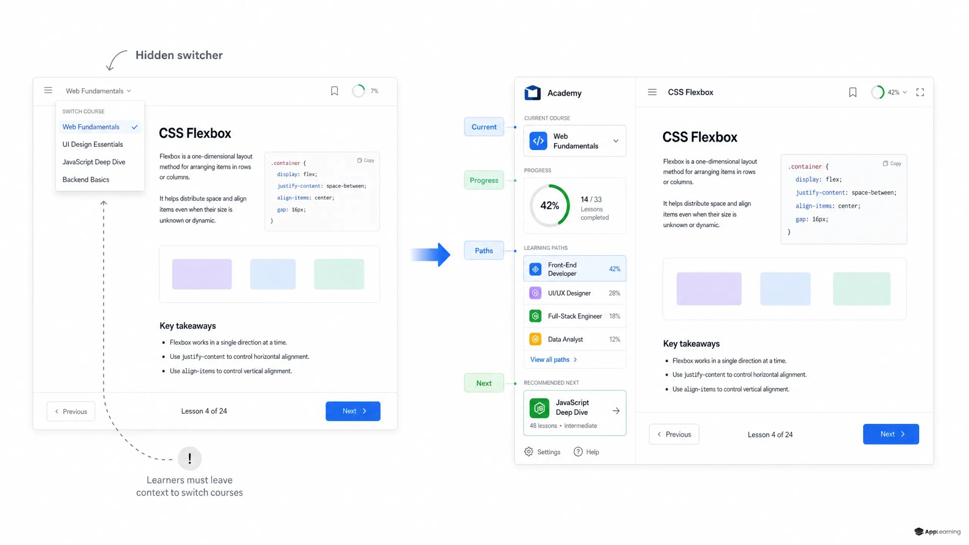
A multi-course academy needs stable context
In a fintech product, learning paths rarely exist for learning alone. They map to activation moments. A user may need to understand account funding, risk controls, tax documents, security settings, Bitcoin withdrawals, or advanced trading features. If those paths feel fragmented, product value stays hidden.
- The active course or path
- Progress inside the current path
- Other available paths in the academy
- Recommended next steps based on role, behavior, or product stage
- A clear route back to the product experience
Persistent context reduces avoidable cognitive load. It also makes the academy feel like a product system instead of a pile of content. The learner should not have to remember where they are. The interface should carry that state.
This is especially important on mobile-first journeys. Space is limited, so structure has to be clearer, not weaker. A compact path switcher, a visible current-course label, and progress cues can do more than another explainer paragraph.
Good to know
When should a course selector move into global navigation?
Move it when learners have more than one meaningful path to choose from, especially if those paths support different product stages, roles, markets, or feature goals.
Is persistent course context still needed on mobile?
Yes. Mobile layouts need less clutter, but not less orientation. The current path, progress state, and route to other paths should remain easy to reach.
What should product teams measure after improving course navigation?
Track switching frequency, path starts, lesson continuation after switching, search behavior, abandoned paths, and downstream activation of the product features each path supports.
Switching data exposes catalog friction
Course switching is also a measurement surface. Jisc defines learning analytics as using learner activity data to understand and improve education processes. In a product academy, switching behavior can show where the catalog confuses users before completion rates collapse.
- Course selector opened but no course chosen
- Frequent switching between similar paths
- Path viewed without starting the first lesson
- Lesson abandoned directly after a switch
- Search used immediately after switching
- Repeated returns to the academy home
These signals are not just engagement metrics. They point to structural questions. Are course names too similar. Are prerequisites unclear. Is one path hiding a high-value feature. Does the catalog reflect the user journey, or the internal team structure.
For product leads, this changes the operating model. The academy is not only a support asset. It becomes a diagnostic layer for activation, retention, and feature adoption. If users cannot find the right learning path, they may also struggle to find the product value behind it.
Build academy navigation that helps users activate faster.
PlanScalable navigation starts before the catalog is large
The right time to fix LMS course navigation is before the catalog becomes dense. Retrofitting structure after dozens of courses means renaming paths, rebuilding analytics, redesigning menus, and explaining new logic to users who already built habits around the old one.
At App-Learning, we treat multi-course academy design as a system problem. The work is not only to place a selector. It is to define the catalog model, the path hierarchy, the progress logic, the mobile behavior, the analytics events, and the future states for recommendations or multilingual versions.
That system view matters for financial products. Education has to stay close to the product, match the brand, support new markets, and reduce the load on internal teams. Navigation is the layer that makes that education usable at scale.
When course switching is treated as a dropdown, the academy stays small even when the catalog grows. When it is treated as information architecture, learners can see where they are, choose where to go, and build confidence without losing their place.