

Key takeaways
- Individually branded lesson graphics turn routine visual changes into content-wide maintenance work.
- Shared tokens centralise brand styling without replacing instructional structure.
- Reusable course components separate learning relationships from their visual presentation.
- Bespoke illustrations earn their cost when standard components would weaken the explanation.
- The next rebrand’s workload reveals how modular an academy really is.
An academy rebrand exposes hidden coupling
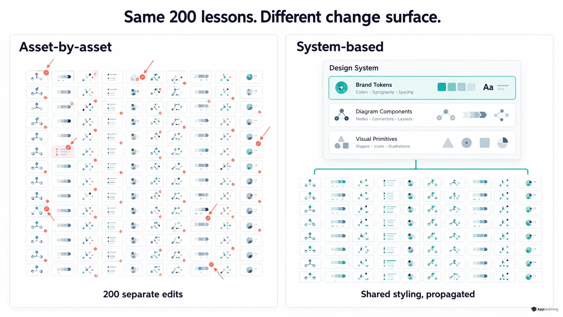
This week, a visual-refresh estimate covered several existing modules and hundreds of learner swipes. The main effort was not changing the application shell. It was adapting or recreating lesson-level SVG assets.
That is an architectural warning, not just a design backlog. When every graphic contains its own brand decisions, every graphic becomes a maintenance task. For a fintech product team, the refresh then competes with work on onboarding and feature education.
Instructional meaning belongs outside the visual skin
A learning design system should distinguish what a visual teaches from how it looks. A custody comparison can store its categories, relationships, labels and explanation separately from fonts, colours and card treatments. A theme should change presentation without rewriting those relationships.
That separation needs guardrails. WCAG’s guidance on colour states that colour must not be the only visual means of conveying information. A warning therefore needs a stable label or symbol, not merely whichever accent colour the new brand provides.
Tokens carry brand decisions across the academy
An LMS design system should centralise colour, typography, spacing, surfaces, borders and interaction states. The Design Tokens Community Group’s format specification supports aliases, allowing tokens to reference shared values rather than duplicate them.
Names should describe purpose. The GOV.UK Design System assigns functional colours by context rather than requiring copied hexadecimal values. For themeable learning content, roles such as warning, emphasis and surface are more useful than names tied to a particular shade.
Reusable components preserve the teaching structure
Tokens alone cannot define a process diagram. Reusable course components need explicit structures for timelines, comparisons, process flows, callouts and charts. Each should accept content and relationships as inputs, with presentation controlled by the theme.
SVG supports CSS-controlled visual properties, but a file extension is not a reuse strategy. The rendering contract must expose the intended styling controls. App-Learning can treat that contract as content architecture, combining shared icons, connectors and containers without making every screen identical.
Bespoke illustration needs an instructional reason
A custom visual earns its place when it explains something a standard component would distort or obscure. The test is instructional value, not novelty. Even bespoke work should use shared primitives where possible, with editable labels and documented exceptions. An instructional visual system needs room for exceptions without making them the default.
Legacy assets need a migration path
Replacing an entire library at once is not the only route. A practical migration starts with repeated patterns and leaves genuinely unique assets for individual review.
- Inventory assets and map their lesson dependencies.
- Group recurring diagrams and identify component candidates.
- Map explicit styling values to tokens where meaning is clear.
- Keep labels in editable, translatable content fields.
- Review representative screens across themes, languages and mobile widths.
Migration tooling should flag ambiguity rather than guess whether a colour means warning or decoration. Versioned components and visual regression checks should make shared changes reviewable before publication.
Review your academy’s visual architecture with App-Learning.
ReviewThe next change is the maturity test
Useful measures include assets edited manually, exceptions requiring review and total refresh effort. The target is not zero review. It is fewer edits tied directly to lesson count.
A reusable academy should absorb a new visual identity through shared decisions, with deliberate exceptions. If every swipe still needs a designer’s attention, the brand has changed, but the maintenance model has not.