

Key takeaways
- Complete learner journeys reveal failures that isolated screen checks miss.
- Short viewport heights deserve explicit coverage alongside narrow widths.
- Success, error and retry states each need a reachable next action.
- Larger text can expose hidden controls and broken scrolling.
- Successful onward navigation belongs in the mobile academy release gate.
Visual responsiveness is a weak pass condition
An academy can look polished on several phones and still block onboarding. For a field-sales operation, the useful acceptance test is whether an agent can complete the lesson, submit the quiz and enter the next required step.
That distinction reflects W3C’s reflow criterion, which requires content to remain available without loss of functionality at specified compact dimensions. Mobile LMS responsive testing should therefore judge progress, not just presentation.
A passed quiz can still become a dead end
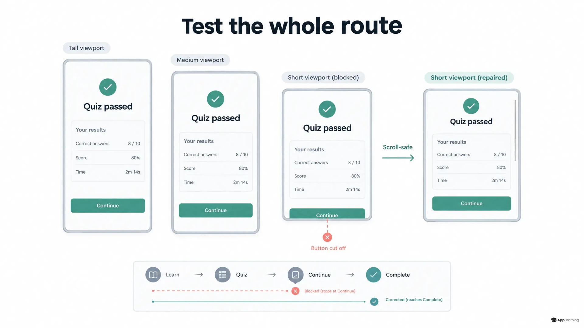
Consider a plausible failure. An agent passes a product quiz. The result panel contains a score, feedback and a continuation button. Everything fits on a tall phone. On a shorter viewport, the button sits below a fixed-height container that cannot scroll.
Nothing overlaps, yet the agent cannot advance. If certification gates campaign access, the layout defect becomes an operational blocker. Quiz completion UX is not complete when the score appears; the required onward action must work.
The test matrix needs height and state
A useful learning app viewport testing matrix starts with the supported agent fleet, including low-end Android devices and the browser or embedded app that delivers training.
- Short and tall aspect ratios, including equal widths with different heights.
- Illustrative CSS viewports such as 320 × 568, 360 × 640 and 360 × 800, refined against fleet evidence.
- Default text, larger system text and browser enlargement.
- Long translated feedback, expanded browser controls and relevant keyboard states.
The Resize Text criterion requires enlargement up to 200% without losing content or functionality, with stated exceptions. Browser enlargement and system text settings deserve separate checks on supported devices.
Reachability depends on the whole layout
The CSS viewport specification distinguishes available space as browser controls expand or retract. Dynamic viewport sizing can help, but changing a height unit is not an acceptance test.
Likewise, safe-area insets describe space needed to avoid display cutouts and interface obstructions. The practical check remains the same: normal touch scrolling must expose the complete control, and tapping it must advance the route. Component sizing, bottom padding and scroll containers serve that outcome.
Every branch needs a usable exit
Mobile microlearning QA should cover passing, failing, retrying and submission errors, including interrupted connectivity. Each branch needs a reachable next action. Locked content needs an accessible explanation and route back to its prerequisite, not an accidental bypass. After each transition, the test should confirm both the destination and the recorded progress.
Automation must prove more than button existence
For web academies, automated tests should complete the critical route across the viewport matrix. Playwright’s click handling can scroll elements into view, so a successful automated click alone is insufficient evidence of normal touch reachability. Explicit scrolling checks and manual runs on representative physical devices should complement automation.
Make onward navigation an academy release gate with App-Learning.
DiscussBlocked progression is a stop-ship defect
The release rule should be explicit: no required continuation control may be unreachable or inoperable within the supported test matrix. A fix needs a full route retest, not another screenshot.
This gives App-Learning a concrete acceptance boundary for academy delivery. An agent who has demonstrated readiness should not need support to escape a result screen. The academy passes when the learner can continue.